Design & UX
The Aim
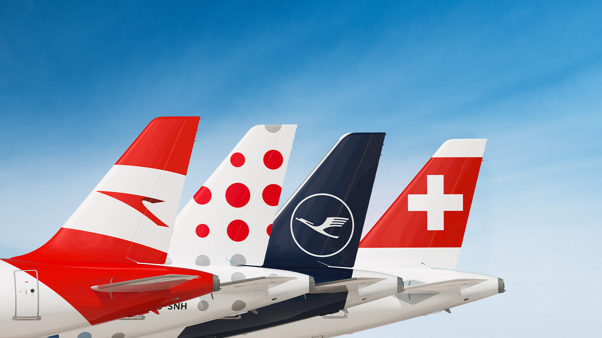
The LOT.com website is meant to be the main Internet sales point for Polish Airlines LOT, offering their passengers a slew of constantly improving services. Our aim was to simplify the presentation of information important to clients and future passengers and to clearly showcase promotions and available services.

The Idea
Above all, we wanted the new platform to be intuitive, accessible, and to encourage people to purchase tickets and additional services. However, we had to be mindful of the habits of airline website users, and thus adopted a balanced approach in terms of introducing modern solutions and the latest trends in web design.

The Execution
We have limited content to a minimum to achieve greater clarity and ease of finding pertinent information. Many topics have been presented in picture and icon form, with brief comments.
Designed all layouts with smaller resolutions in mind, making the website mobile-friendly. We have accentuated elements important to passengers – such as information about their travel, promotions, and additional offers – and made them more accessible.
Our Role
- User-Centric Redesign:
We redesigned the sales platform with a focus on improving the overall comfort of travelers from the moment they engage with lot.com.
Emphasis was placed on simplifying the presentation of information, ensuring a clear distinction between essential and additional services.
- Mobile-Friendly Approach:
Recognizing the increasing prevalence of mobile users, we implemented a mobile-friendly design. Text-heavy sections were replaced with icons and images accompanied by concise comments.
All layouts were meticulously crafted to cater to lower resolutions, ensuring a seamless user experience across various devices.
- Design System Implementation:
We integrated a comprehensive design system into the platform, considering it a fundamental element for long-term success. This not only ensured a consistent and visually appealing user interface but also played a crucial role in maintaining code quality for future developments and extensions.


Our Achievements
- Long-Term Partnership:
The cornerstone of our success lies in the enduring partnership we’ve cultivated with lot.com over five years. This collaboration has resulted in continuous improvements to the platform, directly contributing to the growth in ticket sales.
- Impactful Communication Channels:
Our designs have been seamlessly integrated into various communication channels, such as destination icons, extending the reach and impact of lot.com’s brand and services.
Results
Through our strategic design interventions, we have not only achieved the primary objective of elevating online sales for lot.com but have also forged a lasting partnership that continues to yield positive results. The emphasis on user experience, mobile accessibility, and the implementation of a robust design system has positioned lot.com as a leader in the online travel industry. This case study serves as a testament to our commitment to understanding the business goals of our clients and leveraging design to drive tangible, long-term success.
![Agata Kuich - SYZYGY Warsaw - New Business]()
We look at the wider context of our customers’ needs, being aware of the multidimensionality of digital products.

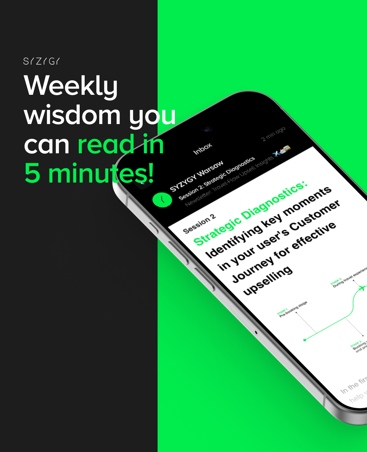
Upselling Guide
Unlocking the essence of strategic UX and UI design, we specialize in pinpointing crucial moments for upselling. Our newsletter serves as a beacon of inspiration for leaders in the tourism and travel industry, unveiling the secrets of effective upselling.